Customizing Front-end Styles
Introduction
The front-end grids and lists are easy to style with custom css. There are a number of ways you can apply custom css in WordPress:
- Some themes expose a CUSTOM CSS editor in the WordPress Customizer.
- You can use your themes functions file to enqueue a custom css script.
- You can create a plugin to load a custom css script.
- There are plugins in WordPress.org that allow you to easily add custom css globally.
We also have a text box in our settings screen (on the WHITE LABEL tab) where you can add custom css.
Below are some examples of what you can do with custom css.
Full Width Server and App Grids
The default width for the server and app grid/list is 1400px. But, if your content area for your theme is larger, you can force the grid to occupy the full width.
.wpcd-grid-table-rows .wpcd-grid-table-row {
     max-width: 100% !important;
}
Change The Number Of Columns in the Server and App Grids
We set both the server and app grid to use three columns on larger screens. You can force it to a different number (eg: 4).
.wpcd-grid-table .wpcd-grid-table-columns,
.wpcd-grid-table .wpcd-grid-table-rows .wpcd-grid-table-row {
     grid-template-columns: 1fr 1fr 1fr 1fr !important;
}
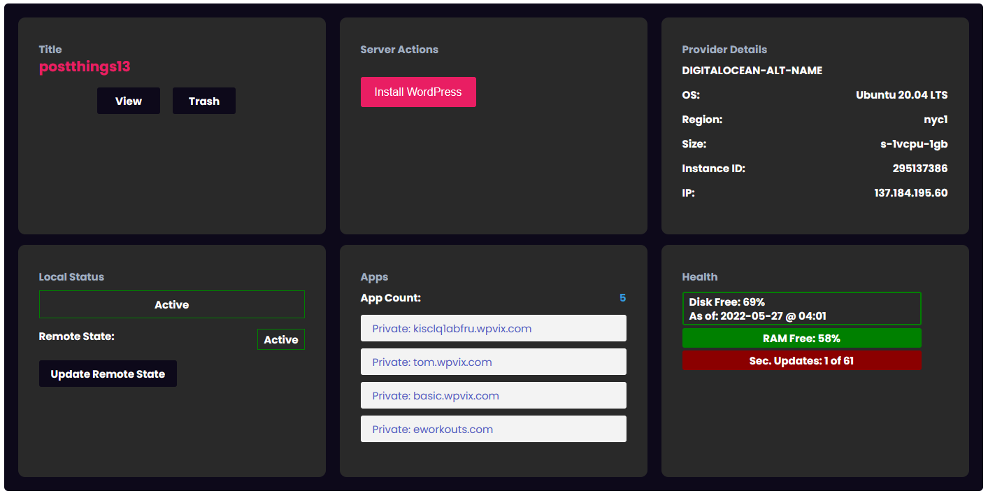
Quick Styles for Dark Mode
.wpcd-grid-table-rows .wpcd-grid-table-row {
     /* Main Container Background */
     background-color: #0D091A !important;
}
.wpcd-grid-table .wpcd-grid-table-cell {
     /* Background for individual cards */
     background-color: #292929 !important;
}
.wpcd-grid-table button {
     /* Buttons need a lighter color since our default is dark. */
     background-color: #E91E63 !important;
}
.wpcd-grid-table {
     /* Text color needs to be white since our default is dark. */
     color: white !important;
}
.wpcd-grid-table .wpcd-server-col-element-label-server_app_link {
     /* Background color on the app count card needs to be dark. */
     background-color: #0D091A !important;
}
#wpcd_public_wrapper button.wpcd_action_install_app {
     /* Fix border weirdness in install wordpress button. */
     border-color: #E91E63 !important;
}
The end result should be something that looks like this:
Combine some things: Two side-by-side rows with three columns
/* Full width .*/
.wpcd-grid-table-rows .wpcd-grid-table-row {
      max-width: 100% !important; }
}
/* Three Columns */
 wpcd-grid-table .wpcd-grid-table-columns, .wpcd-grid-table .wpcd-grid-table-rows .wpcd-grid-table-row {
     grid-template-columns: 1fr 1fr 1fr !important;
}

/* Two rows in a column */
.wpcd-grid-table-rows {
     grid-template-columns: 1fr 1fr !important;
}

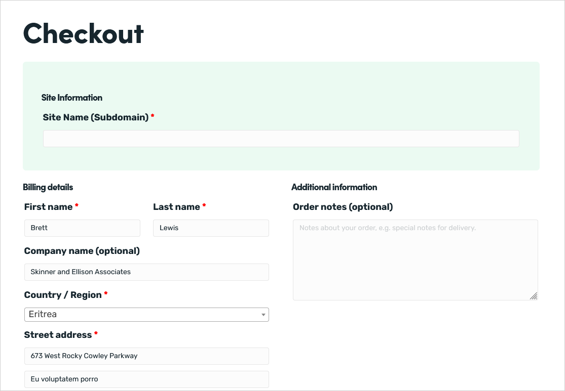
WooCommerce Checkout Styling Tips
If you’re asking for things like site name and other info on the checkout page, here’s a simple set of styles that will help break up the default checkout page a bit better:
/* WPCD custom checkout fields on checkout page.*/
#wpcd_sites_custom_checkout_fields_wrap {
border:solid 1px #EBFAF2;
border-radius:7px;
padding:2em;
background-color:#EBFAF2;
}
This will result in something that looks like this:
Other
- Front-end styling requires WPCloudDeploy 5.0 or later.
More Topics In Tips, Techniques & Education.
- Increase WordPress Upload Size
- How To Access The Entire Server via sFTP
- How Do I Limit PHP Workers For Each Subdomain On A Multisite?
- How To Generate an SSH Key Pair
- Considerations For A Large Number Of Sites On A Single Server
- All The Possible WP-CONFIG.PHP Constants For Core WordPress
- Using MIGRATE GURU To Import Sites
- Force The Use of WWW On A Website
- Local & Remote Statuses On Servers
- CORS Example: Allow Access to Resources Between www and non-www Domains
- Import Sites
- Transferring Sites Between Servers
- Monit vs Netdata vs Monitorix vs GoAccess
- Resolving Common Issues With CloudFlare
- View Used Disk Space For A Site
- How To Generate An SSH Key-Pair With Termius
- How To Change Your DNS Server
- Restoring From AWS S3 Into A New Site or Server
- Tweaking The Malware Scanner
- Handling Low Disk Space Conditions
- Useful OpenLiteSpeed Commands
- Alias Domains
- Custom SSL Certificates

See Also